Flutter 学习笔记(三):Widgets 目录(1)

使用 Flutter 的一套的视觉、结构、平台、和交互式的 widgets,快速创建漂亮的 APP。
基础组件
在构建 Flutter 应用程序之前,绝对要了解的 widgets。下面大概是一大组类似 iOS 中官方提供的 UI 控件,下面一起看一下吧。
Container
Container class 将 common 绘制、定位和大小 widget 相结合的便利 widget。
你是否有 widget 需要一些背景样式?也许是背景颜色或形状?还是一些尺寸限制?尝试将其包装在 Container widget 中。Container widget 可帮助你组成、装饰和定位子 widget。如果将 widget 包装在没有任何其他参数的 Container 小部件中,则不会发现外观上的任何差异。但是,如果添加 Color 参数,则你的子窗口 widget 将获得背景色。没有任何其他内容,Container 将根据其子 widget 自行调整大小。使用 Container 的 padding 属性在子 widget 和 Container 边界之间添加空白,并使用 margin 属性添加围绕 widget 的空白。使用 Decoration 属性可以在 Container 中添加一个形状,例如圆形。默认情况下 decoration 的大小是根据 Container 的子项。在这种情况下,Container 对准圆形装饰最窄的参数--文本 widget 的高度。你可以像以前一样使用 padding 和 margin 来设计 decoration。使用 Alignment 属性,可以使子 widget 在 container 中对齐。设置对齐方式后,container 将展开以填充其父级的宽度和高度。你可以通过设置 container 的宽度和高度属性。或使用箱式布局模型来覆盖此设置。例如,使用 BoxConstraints,你的 container 可以扩展以填充给定的大小。你甚至可以将 transform 应用于 container。
Container(
  child: Text('Less boring'),
  decoration: BoxDecoration(
    shape: BoxShape.circle,
    color: Colors.blue,
  ),
  margin: EdgeInsets.all(25.0),
  padding: EdgeInsets.all(40.0),
  alignment: Alignment.center,
  width: 200,
  height: 100,
  constraints: BoxConstraints.tightForFinite(
    width: 200,
  ),
  transform: Matrix4.rotationZ(0.05),
);
Row
Row class 在水平阵列(horizontal array)中显示其子项的 widget(在水平方向上排列子 widget 的列表)。要使子项扩展以填充可用的水平空间,请将子项包裹在 Expanded widget 中。Row widget 不会滚动(通常,如果 Row 中的子项多于 available room 的容量,则被认为是错误的)。如果你有 Row widget 并希望它们能够在空间不足的情况下滚动,请考虑使用 ListView。
Row(
  children: const <Widget>[
    Expanded(
      child: Text('Deliver features faster', textAlign: TextAlign.center),
    ),
    Expanded(
      child: Text('Craft beautiful UIs', textAlign: TextAlign.center),
    ),
    Expanded(
      child: FittedBox(
        fit: BoxFit.contain, // otherwise the logo will be tiny
        child: FlutterLogo(),
      ),
    ),
  ],
)
Column
Column class 在垂直阵列(vertical array)中显示其子项的 widget(在垂直方向上排列子 widget 的列表)。要使子项扩展以填充可用的垂直空间,请将子项包裹在 Expanded widget 中。Column widget 不会滚动(并且通常认为 Column 中的子项多于 available room 的数量是错误的)。如果你有一行 widget 并希望它们能够在空间不足的情况下滚动,请考虑使用 ListView。
Column(
  children: const <Widget>[
    Text('Deliver features faster'),
    Text('Craft beautiful UIs'),
    Expanded(
      child: FittedBox(
        fit: BoxFit.contain, // otherwise the logo will be tiny
        child: FlutterLogo(),
      ),
    ),
  ],
)
Image
Image class 显示图像的 widget。
有时 App 需要显示图片,好在 Flutter 有个叫 Image 的 widget 正好派上用场。这 widget 能让图片显示于屏幕。Flutter 提取显示图像的方式有很多种。这图像可能来自你的 App 所保存的 Asset Bundle 使用 Image.asset,并提供 asset 名称。Image.asset 会根据设备的像素密度自动以适当版本显示文件。你只需要提供其他版本,并在 pubspec.yaml 加列。你也可以显示来自网络的图像。这得用上 Image.network(),并提供一个 URL。Flutter 将以加载缓存的方式显示图片(Web images are cached automatically)。请记住,网络图片的加载速度,可能不及 Asset 中的图片且用户得联网才能看到初始图像。你可提交 loadingBuilder 让框架反复调用以便从网络下载图片。loadingBuilder 内含下载进度参数 progress,你可用来让用户知道实际图像还要多久才会下载完毕并显示。你还可以选择显示来自用户设备的图档,这部分可利用 Image.file,而且以字节数组存于内存的图像,也可藉此显示于屏幕,用 Image.memory 就可办到。无论图像档来源为何,都可用参数加以配置。设定属性 width and/or height,便能确定图像的显示规格,且能避免加载布局时出现难看的抖动。设置图片的 fit 属性以分配其刻入布局的空间。默认选项为 contain 但还有其他选项,包括可拉伸图片的 fill,而 cover 就是不拉伸。你还可以使用 color 和 colorBlendMode 为图像来套色(类似原生的 tint color)。有很多选择。别忘了为图像加上语义化标签 semanticLabel。这些将显示在辅助技术中(类似 iOS 中的旁白),并使你的应用更易于访问。Flutter 支持 JPEG、PNG、GIF、WebP、位图和 WBMP。你也可以显示 GIF 和 WebP 动画。
Image.network(
  'https://example.com/dash.jpg',
  loadingBuilder: (context, child, progress) {
    return progress == null
        ? child
        : LinearProgressIndicator(...);
  },
)
Image.file(
  '/path/to/dash.jpg',
)
Image.memory(
  myUint8List,
)
Image.asset(
  'assets/images/dash.jpg',
  width: 200,
  height: 400,
  fit: BoxFit.contain,
  color: Colors.red,
  colorBlendMode: BlendMode.darken,
  semanticLabel: 'Dash mascot',
)
flutter:
  assets:
    - images/dash.png
    - images/2x/dash.png
Image.network(
  'http://example.com/dash.jpg',
)
为指定图像的各种方式提供了几个构造函数:
- new Image,用于从 ImageProvider 获取图像。
- new Image.asset,用于使用 key 从 AssetBundle 获取图像。
- new Image.network,用于从 URL 获取图像。
- new Image.file,用于从 file 中获取图像。
- new Image.memory,用于从 Uint8List 获取图像。
支持以下图像格式:JPEG、PNG、GIF、Animated GIF、WebP、Animated WebP、BMP 和 WBMP。底层平台(iOS/android)可能支持其他格式。 Flutter 会尝试调用平台 API 来解码无法识别的格式,如果平台 API 支持解码图像,Flutter 将能够渲染它。
要自动执行 pixel-density-aware asset resolution,请使用 AssetImage 指定图像并确保 MaterialApp、WidgetsApp 或 MediaQuery widget 存在于 widget 树中的 Image widget 上方。
图像是使用 paintImage 绘制的,它更详细地描述了这个类上各个字段的含义。
默认构造函数可以与任何 ImageProvider 一起使用,例如 NetworkImage,以显示来自 Internet 的图像。
const Image(
  image: NetworkImage('https://flutter.github.io/assets-for-api-docs/assets/widgets/owl.jpg'),
)
为方便起见,Image Widget 还提供了几个构造函数来显示不同类型的图像。在此示例中,使用 Image.network 构造函数显示来自 Internet 的图像。
Image.network('https://flutter.github.io/assets-for-api-docs/assets/widgets/owl-2.jpg')
Image.asset、Image.network、Image.file 和 Image.memory 构造函数允许通过 cacheWidth 和 cacheHeight 参数指定自定义解码大小。引擎会将图片解码到指定的大小,主要是为了减少 ImageCache 的内存使用。在 Web 平台上使用网络图片的情况下,cacheWidth 和 cacheHeight 参数会被忽略,因为 Web 引擎将网络图片的图片解码委托给 Web,不支持自定义解码大小。
Text
Text class 单一格式的文本。Text widget 显示具有单一样式的文本字符串。根据布局约束,字符串可能会跨越多行,也可能全部显示在同一行上。style 参数是可选的。省略时,文本将使用最近的 enclosing DefaultTextStyle 中的样式。如果给定 style 的 TextStyle.inherit 属性为 true(默认值),则给定 style 将与最接近的 enclosing DefaultTextStyle 合并。这种合并行为很有用,例如,在使用默认字体系列和大小时使文本加粗。
Text(
  'Hello, $_name! How are you?',
  textAlign: TextAlign.center,
  overflow: TextOverflow.ellipsis,
  style: const TextStyle(fontWeight: FontWeight.bold),
)
使用 Text.rich 构造函数,Text widget 可以显示具有不同样式 TextSpans 的段落。下面的示例以不同的样式为每个单词显示 “Hello beautiful world”。
const Text.rich(
  TextSpan(
    text: 'Hello', // default text style
    children: <TextSpan>[
      TextSpan(text: ' beautiful ', style: TextStyle(fontStyle: FontStyle.italic)),
      TextSpan(text: 'world', style: TextStyle(fontWeight: FontWeight.bold)),
    ],
  ),
)
Text 的交互性:
- 要使 Text 对触摸事件作出反应,请将其包装在 GestureDetector.onTap 处理程序的 GestureDetector widget 中。
- 在 material design 应用程序中,请考虑使用 TextButton,或者如果这不合适,至少使用 InkWell 而不是 GestureDetector。
- 要使文本部分具有交互性,请使用 RichText 并指定 TapGestureRecognizer 作为文本相关部分的 TextSpan.recognizer。
Icon
Icon class 使用 IconData 中描述的字体的字形绘制的图形图标 widget,例如 Icons 中 material 的预定义 IconData。
Icons 不是交互式的。对于交互式图标,请考虑 Material 中的 IconButton。
Row(
  mainAxisAlignment: MainAxisAlignment.spaceAround,
  children: const <Widget>[
    Icon(
      Icons.favorite,
      color: Colors.pink,
      size: 24.0,
      semanticLabel: 'Text to announce in accessibility modes',
    ),
    Icon(
      Icons.audiotrack,
      color: Colors.green,
      size: 30.0,
    ),
    Icon(
      Icons.beach_access,
      color: Colors.blue,
      size: 36.0,
    ),
  ],
)
RaisedButton
RaisedButton class Material Design 中的 button, 一个凸起的材质矩形按钮。
This class is deprecated, please use ElevatedButton instead. 已废弃,用 ElevatedButton 代替。
ElevatedButton class 使用升高的按钮为原本大部分为平面的布局添加维度,例如在长而繁忙的内容列表中,或在广阔的空间中。避免在对话框或卡片等已经提升的内容上使用提升的按钮。
Scaffold
Scaffold class Material Design 布局结构的基本实现。此 widget 类提供了用于显示 drawer、snackbar 和底部 sheet 的 API。
Appbar
AppBar class 一个 Material Design 应用程序栏,由工具栏和其他可能的 widget(如 TabBar 和 FlexibleSpaceBar )组成。
FlutterLogo
FlutterLogo class Flutter logo, 以 widge t形式,这个 widget 遵从 IconTheme。
Placeholder
Placeholder class 一个绘制了一个盒子的 widget,代表日后有 widget 将会被添加到该盒子中。这个 widget 在开发过程中很有用,可以指示界面尚未完成。
Material Components Widgets
实现了Material Design 指南的视觉、效果、motion-rich 的 widget。
BottomNavigationBar
BottomNavigationBar class 底部导航条,可以很容易地在 tap 之间切换和浏览顶级视图。(类似 iOS 的底部 UITabBarController 的功能)
显示在应用底部的 material widget,用于在少量视图中进行选择,通常在三到五个视图之间(类似 iOS 中程序首页底部 3 到 5 个 tabbar)。底部导航栏由 text labels、icons 或两者兼有的形式的多个 items 组成,它们都铺在 material 的顶部。底部导航栏提供了应用程序的顶级视图之间的快速导航。对于较大的屏幕,侧导航可能更合适。
底部导航栏通常与 Scaffold 结合使用,它作为 Scaffold.bottomNavigationBar 参数提供。
底部导航栏的 type 会更改其 items 显示方式。如果未指定,则在少于四个 items 时自动设置为 BottomNavigationBarType.fixed,否则设置为 BottomNavigationBarType.shifting。items 的长度必须至少为两个,并且每个 item 的 icon 和 title/label 不得为空。
- BottomNavigationBarType.fixed,少于四个 items 时的默认值。如果 selected item 不为 null,则使用 selectedItemColor 颜色对其进行渲染,否则主题的 ColorScheme.primary 颜色用于 Brightness.light 主题,ColorScheme.secondary 用于 Brightness.dark 主题。如果 backgroundColor 为 null,则导航栏的背景色默认为 Material 背景色 ThemeData.canvasColor(本质上是不透明的白色)。
- BottomNavigationBarType.shifting,当有四个或更多 items 时的默认值。如果 selectedItemColor 为 null,则所有 items 都呈现为白色。导航栏的背景颜色与 selected item 的 BottomNavigationBarItem.backgroundColor 相同。在这种情况下,假设每个 item 将具有不同的背景颜色,并且该背景颜色将与白色形成鲜明对比。
int _selectedIndex = 0;

static const TextStyle optionStyle = TextStyle(fontSize: 30, fontWeight: FontWeight.bold);

static const List<Widget> _widgetOptions = <Widget>[
  Text(
    'Index 0: Home',
    style: optionStyle,
  ),
  Text(
     'Index 1: Business',
     style: optionStyle,
  ),
  Text(
     'Index 2: School',
     style: optionStyle,
  ),
];

void _onItemTapped(int index) {
  setState(() {
    _selectedIndex = index;
  });
}

@override
Widget build(BuildContext context) {
  return Scaffold(
    appBar: AppBar(
      title: const Text('BottomNavigationBar Sample'),
    ),
    body: Center(
      child: _widgetOptions.elementAt(_selectedIndex),
    ),
    bottomNavigationBar: BottomNavigationBar(
      items: const <BottomNavigationBarItem>[
        BottomNavigationBarItem(
          icon: Icon(Icons.home),
          label: 'Home',
        ),
        BottomNavigationBarItem(
          icon: Icon(Icons.business),
          label: 'Business',
        ),
        BottomNavigationBarItem(
          icon: Icon(Icons.school),
          label: 'School',
        ),
      ],
      currentIndex: _selectedIndex,
      selectedItemColor: Colors.amber[800],
      onTap: _onItemTapped,
    ),
  );
}
int _selectedIndex = 0;

static const TextStyle optionStyle = TextStyle(fontSize: 30, fontWeight: FontWeight.bold);

static const List<Widget> _widgetOptions = <Widget>[
  Text(
    'Index 0: Home',
    style: optionStyle,
  ),
  Text(
    'Index 1: Business',
    style: optionStyle,
  ),
  Text(
    'Index 2: School',
    style: optionStyle,
  ),
  Text(
    'Index 3: Settings',
    style: optionStyle,
  ),
];

void _onItemTapped(int index) {
  setState(() {
    _selectedIndex = index;
  });
}

@override
Widget build(BuildContext context) {
  return Scaffold(
    appBar: AppBar(
      title: const Text('BottomNavigationBar Sample'),
    ),
    body: Center(
      child: _widgetOptions.elementAt(_selectedIndex),
    ),
    bottomNavigationBar: BottomNavigationBar(
      items: const <BottomNavigationBarItem>[
        BottomNavigationBarItem(
          icon: Icon(Icons.home),
          label: 'Home',
          backgroundColor: Colors.red,
        ),
        BottomNavigationBarItem(
          icon: Icon(Icons.business),
          label: 'Business',
          backgroundColor: Colors.green,
        ),
        BottomNavigationBarItem(
          icon: Icon(Icons.school),
          label: 'School',
          backgroundColor: Colors.purple,
        ),
        BottomNavigationBarItem(
          icon: Icon(Icons.settings),
          label: 'Settings',
          backgroundColor: Colors.pink,
        ),
      ],
      currentIndex: _selectedIndex,
      selectedItemColor: Colors.amber[800],
      onTap: _onItemTapped,
    ),
  );
}
TabBar
TabBar class 一个显示水平选项卡(horizontal row of tabs)的 Material Design widget。(类似 iOS 中比较常见的滑动标签,在页面顶部有一组标签,点击每个标签对标签下面的视图进行切换)
DefaultTabController、TabBar 和 TabBarView:你需要将 widget 置入标签页吗?那么,你可以选用 DefaultTabController、TabBar 和 TabBarView widget,要使用标签页,你首先需要一个标签页控制器(DefaultTabController),将选定的标签页和可见内容保持同步化最简单的方法是使用 DefaultTabController,一旦你有了这个东西你将需要一个能够显示用户在标签页之间切换不同内容的 widget,在这个阶段,你可以使用 TabBar,TabBar 接收标签页 widget 的列表,最后你需要为每个标签页创建内容,在这个阶段,你可以使用 TabBarView,子项目所列出的每一个 widget 都对应于 TabBar 中的标签页,标签页和 TabView 的子项目之间必须一对一进行匹配。
如下示例代码,TabBar 和 TabBarView 一一对应。
Widget build(BuildContext context) {
  return DefaultTabController(
    initialIndex: 1,
    length: 3,
    child: Scaffold(
      appBar: AppBar(
        title: const Text('TabBar Widget'),
        bottom: const TabBar(
          tabs: <Widget>[
            Tab(
              icon: Icon(Icons.cloud_outlined),
            ),
            Tab(
              icon: Icon(Icons.beach_access_sharp),
            ),
            Tab(
              icon: Icon(Icons.brightness_5_sharp),
            ),
          ],
        ),
      ),
      body: const TabBarView(
        children: <Widget>[
          Center(
            child: Text("It's cloudy here"),
          ),
          Center(
            child: Text("It's rainy here"),
          ),
          Center(
            child: Text("It's sunny here"),
          ),
        ],
      ),
    ),
  );
}
TabBarView
TabBarView class 显示与当前选中的选项卡相对应的页面视图。通常和 TabBar 一起使用。A page view that displays the widget which corresponds to the currently selected tab.
MaterialApp class
MaterialApp class 一个便利的 widget,它封装了应用程序实现 Material Design 通常所需要的一些 widget。它通过添加特定于 material-design 的功能(例如 AnimatedTheme 和 GridPaper)构建在 WidgetsApp 之上。
The MaterialApp configures the top-level Navigator to search for routes in the following order:
- For the / route, the home property, if non-null, is used.
- Otherwise, the routes table is used, if it has an entry for the route.
- Otherwise, onGenerateRoute is called, if provided. It should return a non-null value for any valid route not handled by home and routes.
- Finally if all else fails onUnknownRoute is called.
If a Navigator is created, at least one of these options must handle the / route, since it is used when an invalid initialRoute is specified on startup (e.g. by another application launching this one with an intent on Android; see dart:ui.PlatformDispatcher.defaultRouteName).
This widget also configures the observer of the top-level Navigator (if any) to perform Hero animations.
If home, routes, onGenerateRoute, and onUnknownRoute are all null, and builder is not null, then no Navigator is created.
MaterialApp(
  routes: <String, WidgetBuilder>{
    '/': (BuildContext context) {
      return Scaffold(
        appBar: AppBar(
          title: const Text('Home Route'),
        ),
      );
    },
    '/about': (BuildContext context) {
      return Scaffold(
        appBar: AppBar(
          title: const Text('About Route'),
        ),
      );
     }
   },
)
WidgetsApp
WidgetsApp class 一个便利的 widget,它封装了应用程序通常需要的一些 widget。
WidgetsApp 提供的主要角色之一是将系统后退按钮绑定为弹出 Navigator 或退出应用程序。
它由 MaterialApp 和 CupertinoApp 用于实现应用程序的基本功能。
使用 MediaQuery.fromWindow 构建 MediaQuery。要使用继承的 MediaQuery,请设置 useInheritedMediaQuery 为 true。
Drawer
Drawer class 从 Scaffold 边缘水平滑动以显示应用程序中导航链接的 Material Design 面板。(类似 iOS App 中左右两边的抽屉效果)
Scaffold(
  appBar: AppBar(
    title: const Text('Drawer Demo'),
  ),
  drawer: Drawer(
    child: ListView(
      padding: EdgeInsets.zero,
      children: const <Widget>[
        DrawerHeader(
          decoration: BoxDecoration(
            color: Colors.blue,
          ),
          child: Text(
            'Drawer Header',
            style: TextStyle(
              color: Colors.white,
              fontSize: 24,
            ),
          ),
        ),
        ListTile(
          leading: Icon(Icons.message),
          title: Text('Messages'),
        ),
        ListTile(
          leading: Icon(Icons.account_circle),
          title: Text('Profile'),
        ),
        ListTile(
          leading: Icon(Icons.settings),
          title: Text('Settings'),
        ),
      ],
    ),
  ),
)
RaisedButton
RaisedButton class Material Design 中的 button, 一个凸起的材质矩形按钮。(This class is deprecated, please use ElevatedButton instead. 此类已经被废弃了,使用 ElevatedButton 来代替。)
FloatingActionButton
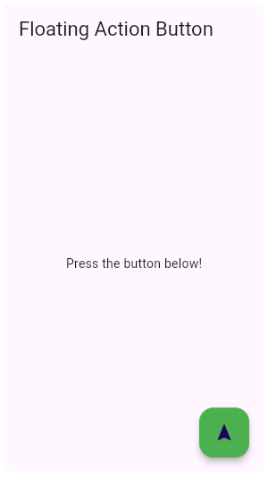
FloatingActionButton class 一个圆形图标按钮,它悬停在内容之上,以展示应用程序中的主要动作。FloatingActionButton 通常用于 Scaffold.floatingActionButton 字段。
在 Flutter 中添加 FloatingActionButton 非常容易。只需要将 FloatingActionButton 添加到 Scaffold 中即可。但是,如果你有一个 BottomNavigationBar,并且想要 FloatingActionButton 嵌入其中,该怎么办?首先,将 BottomNavigationBar 添加到你的 Scaffold 中。然后,使用 FloatingActionButtonLocation 嵌入 FloatingActionButton。
Scaffold(
  floatingActionButton: ...
  bottomNavigationBar: ...
  floatingActionButtonLocation:
    FloatingActionButtonLocation.endDocked,
);
如果想要 FloatingActionButton 在中间显示,可以尝试将 endDocked 更改为 centerDocked。现在 FloatingActionButton 已整齐的嵌入 BottomNavigationBar 中了。
/// Flutter code sample for FloatingActionButton
// This example shows how to display a [FloatingActionButton] in a
// [Scaffold], with a pink [backgroundColor] and a thumbs up [Icon].
//
// 
import 'package:flutter/material.dart';
void main() => runApp(const MyApp());
/// This is the main application widget.
class MyApp extends StatelessWidget {
const MyApp({Key? key}) : super(key: key);
static const String _title = 'Flutter Code Sample';
@override
Widget build(BuildContext context) {
return const MaterialApp(
title: _title,
home: MyStatelessWidget(),
);
}
}
/// This is the stateless widget that the main application instantiates.
class MyStatelessWidget extends StatelessWidget {
const MyStatelessWidget({Key? key}) : super(key: key);
@override
Widget build(BuildContext context) {
return Scaffold(
appBar: AppBar(
title: const Text('Floating Action Button'),
),
body: const Center(child: Text('Press the button below!')),
floatingActionButton: FloatingActionButton(
onPressed: () {
// 点击后的响应事件
// Add your onPressed code here!
},
child: const Icon(Icons.navigation),
backgroundColor: Colors.green,
),
);
}
}
FlatButton class
FlatButton class 一个扁平的 Material 按钮。(This class is deprecated, please use TextButton instead. 此类已经被废弃了,使用 TextButton 来代替。)
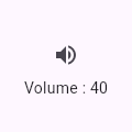
IconButton class
IconButton class 一个 Material 图标按钮,点击时会有水波动画。
/// Flutter code sample for IconButton
// This sample shows an `IconButton` that uses the Material icon "volume_up" to
// increase the volume.
//
// 
import 'package:flutter/material.dart';
void main() => runApp(const MyApp());
/// This is the main application widget.
class MyApp extends StatelessWidget {
const MyApp({Key? key}) : super(key: key);
static const String _title = 'Flutter Code Sample';
@override
Widget build(BuildContext context) {
return MaterialApp(
title: _title,
home: Scaffold(
appBar: AppBar(title: const Text(_title)),
body: const Center(
child: MyStatefulWidget(),
),
),
);
}
}
double _volume = 0.0;
/// This is the stateful widget that the main application instantiates.
class MyStatefulWidget extends StatefulWidget {
const MyStatefulWidget({Key? key}) : super(key: key);
@override
State<MyStatefulWidget> createState() => _MyStatefulWidgetState();
}
/// This is the private State class that goes with MyStatefulWidget.
class _MyStatefulWidgetState extends State<MyStatefulWidget> {
@override
Widget build(BuildContext context) {
return Column(
mainAxisSize: MainAxisSize.min,
children: <Widget>[
IconButton(
icon: const Icon(Icons.volume_up),
tooltip: 'Increase volume by 10',
onPressed: () {
setState(() {
_volume += 10;
});
},
),
Text('Volume : $_volume')
],
);
}
}
PopupMenuButton class
PopupMenuButton class 当菜单隐藏式,点击或调用 onSelected 时显示一个弹出式菜单列表。
// This is the type used by the popup menu below.
enum WhyFarther { harder, smarter, selfStarter, tradingCharter }

// This menu button widget updates a _selection field (of type WhyFarther, not shown here).

PopupMenuButton<WhyFarther>(
  onSelected: (WhyFarther result) { setState(() { _selection = result; }); },
  itemBuilder: (BuildContext context) => <PopupMenuEntry<WhyFarther>>[
    const PopupMenuItem<WhyFarther>(
      value: WhyFarther.harder,
      child: Text('Working a lot harder'),
    ),
    const PopupMenuItem<WhyFarther>(
      value: WhyFarther.smarter,
      child: Text('Being a lot smarter'),
    ),
    const PopupMenuItem<WhyFarther>(
      value: WhyFarther.selfStarter,
      child: Text('Being a self-starter'),
    ),
    const PopupMenuItem<WhyFarther>(
      value: WhyFarther.tradingCharter,
      child: Text('Placed in charge of trading charter'),
    ),
  ],
)
ButtonBar class
ButtonBar class 水平排列的按钮组。
TextField class
TextField class 文本输入框。(类比 iOS 的 UITextField)
const TextField(
  obscureText: true,
  decoration: InputDecoration(
    border: OutlineInputBorder(),
    labelText: 'Password',
  ),
)
Checkbox class
Checkbox class 复选框(多选框),允许用户从一组中选择多个选项。
bool isChecked = false;

@override
Widget build(BuildContext context) {
  Color getColor(Set<MaterialState> states) {
    const Set<MaterialState> interactiveStates = <MaterialState>{
      MaterialState.pressed,
      MaterialState.hovered,
      MaterialState.focused,
    };
    if (states.any(interactiveStates.contains)) {
      return Colors.blue;
    }
    return Colors.red;
  }
  return Checkbox(
    checkColor: Colors.white,
    fillColor: MaterialStateProperty.resolveWith(getColor),
    value: isChecked,
    onChanged: (bool? value) {
      setState(() {
        isChecked = value!;
      });
    },
  );
}
Radio class
Radio class 单选框,允许用户从一组中选择一个选项。
用于在多个相互排斥的值之间进行选择。当选定组中的一个 radio button 时,组中的其他 radio buttons 将停止选择。值为 T 型,即 Radio 的类型参数。常用于此目的。
/// Flutter code sample for Radio

// Here is an example of Radio widgets wrapped in ListTiles, which is similar
// to what you could get with the RadioListTile widget.
//
// The currently selected character is passed into `groupValue`, which is
// maintained by the example's `State`. In this case, the first `Radio`
// will start off selected because `_character` is initialized to
// `SingingCharacter.lafayette`.
//
// If the second radio button is pressed, the example's state is updated
// with `setState`, updating `_character` to `SingingCharacter.jefferson`.
// This causes the buttons to rebuild with the updated `groupValue`, and
// therefore the selection of the second button.
//
// Requires one of its ancestors to be a [Material] widget.

import 'package:flutter/material.dart';

void main() => runApp(const MyApp());

/// This is the main application widget.
class MyApp extends StatelessWidget {
  const MyApp({Key? key}) : super(key: key);

  static const String _title = 'Flutter Code Sample';

  @override
  Widget build(BuildContext context) {
    return MaterialApp(
      title: _title,
      home: Scaffold(
        appBar: AppBar(title: const Text(_title)),
        body: const Center(
          child: MyStatefulWidget(),
        ),
      ),
    );
  }
}

enum SingingCharacter { lafayette, jefferson }

/// This is the stateful widget that the main application instantiates.
class MyStatefulWidget extends StatefulWidget {
  const MyStatefulWidget({Key? key}) : super(key: key);

  @override
  State<MyStatefulWidget> createState() => _MyStatefulWidgetState();
}

/// This is the private State class that goes with MyStatefulWidget.
class _MyStatefulWidgetState extends State<MyStatefulWidget> {
  SingingCharacter? _character = SingingCharacter.lafayette;

  @override
  Widget build(BuildContext context) {
    return Column(
      children: <Widget>[
        ListTile(
          title: const Text('Lafayette'),
          leading: Radio<SingingCharacter>(
            value: SingingCharacter.lafayette,
            groupValue: _character,
            onChanged: (SingingCharacter? value) {
              setState(() {
                _character = value;
              });
            },
          ),
        ),
        ListTile(
          title: const Text('Thomas Jefferson'),
          leading: Radio<SingingCharacter>(
            value: SingingCharacter.jefferson,
            groupValue: _character,
            onChanged: (SingingCharacter? value) {
              setState(() {
                _character = value;
              });
            },
          ),
        ),
      ],
    );
  }
}
Switch class
Switch class On/off 用于切换一个单一状态。
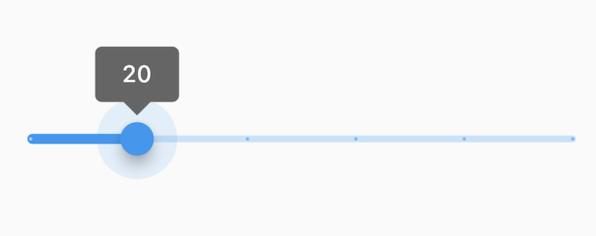
Slider class
Slider class 滑块,允许用户通过滑动滑块来从一系列值中选择。
/// Flutter code sample for Slider
// 
//
// The Sliders value is part of the Stateful widget subclass to change the value
// setState was called.
import 'package:flutter/material.dart';
void main() => runApp(const MyApp());
/// This is the main application widget.
class MyApp extends StatelessWidget {
const MyApp({Key? key}) : super(key: key);
static const String _title = 'Flutter Code Sample';
@override
Widget build(BuildContext context) {
return MaterialApp(
title: _title,
home: Scaffold(
appBar: AppBar(title: const Text(_title)),
body: const MyStatefulWidget(),
),
);
}
}
/// This is the stateful widget that the main application instantiates.
class MyStatefulWidget extends StatefulWidget {
const MyStatefulWidget({Key? key}) : super(key: key);
@override
State<MyStatefulWidget> createState() => _MyStatefulWidgetState();
}
/// This is the private State class that goes with MyStatefulWidget.
class _MyStatefulWidgetState extends State<MyStatefulWidget> {
double _currentSliderValue = 20;
@override
Widget build(BuildContext context) {
return Slider(
value: _currentSliderValue,
min: 0,
max: 100,
divisions: 5,
label: _currentSliderValue.round().toString(),
onChanged: (double value) {
setState(() {
_currentSliderValue = value;
});
},
);
}
}
Date & Time Pickers
Date & Time Pickers 日期&时间选择器。
Chip class
Chip class 标签,一个 Material widget。 它可以将一个复杂内容实体展现在一个小块中,如联系人。
Card class
Card class 一个 Material Design 卡片,拥有一个圆角和阴影。
/// Flutter code sample for Card

// This sample shows creation of a [Card] widget that shows album information and two actions.

import 'package:flutter/material.dart';

void main() => runApp(const MyApp());

/// This is the main application widget.
class MyApp extends StatelessWidget {
  const MyApp({Key? key}) : super(key: key);

  static const String _title = 'Flutter Code Sample';

  @override
  Widget build(BuildContext context) {
    return MaterialApp(
      title: _title,
      home: Scaffold(
        appBar: AppBar(title: const Text(_title)),
        body: const MyStatelessWidget(),
      ),
    );
  }
}

/// This is the stateless widget that the main application instantiates.
class MyStatelessWidget extends StatelessWidget {
  const MyStatelessWidget({Key? key}) : super(key: key);

  @override
  Widget build(BuildContext context) {
    return Center(
      child: Card(
        child: Column(
          mainAxisSize: MainAxisSize.min,
          children: <Widget>[
            const ListTile(
              leading: Icon(Icons.album),
              title: Text('The Enchanted Nightingale'),
              subtitle: Text('Music by Julie Gable. Lyrics by Sidney Stein.'),
            ),
            Row(
              mainAxisAlignment: MainAxisAlignment.end,
              children: <Widget>[
                TextButton(
                  child: const Text('BUY TICKETS'),
                  onPressed: () {/* ... */},
                ),
                const SizedBox(width: 8),
                TextButton(
                  child: const Text('LISTEN'),
                  onPressed: () {/* ... */},
                ),
                const SizedBox(width: 8),
              ],
            ),
          ],
        ),
      ),
    );
  }
}
ListTile class
ListTile class 一个固定高度的行,通常包含一些文本,以及一个行前或行尾图标。

/// Flutter code sample for ListTile

// Here is an example of a custom list item that resembles a YouTube-related video list item created with [Expanded] and [Container] widgets.

import 'package:flutter/material.dart';

void main() => runApp(const MyApp());

/// This is the main application widget.
class MyApp extends StatelessWidget {
  const MyApp({Key? key}) : super(key: key);

  static const String _title = 'Flutter Code Sample';

  @override
  Widget build(BuildContext context) {
    return MaterialApp(
      title: _title,
      home: Scaffold(
        appBar: AppBar(title: const Text(_title)),
        body: const MyStatelessWidget(),
      ),
    );
  }
}

class CustomListItem extends StatelessWidget {
  const CustomListItem({
    Key? key,
    required this.thumbnail,
    required this.title,
    required this.user,
    required this.viewCount,
  }) : super(key: key);

  final Widget thumbnail;
  final String title;
  final String user;
  final int viewCount;

  @override
  Widget build(BuildContext context) {
    return Padding(
      padding: const EdgeInsets.symmetric(vertical: 5.0),
      child: Row(
        crossAxisAlignment: CrossAxisAlignment.start,
        children: <Widget>[
          Expanded(
            flex: 2,
            child: thumbnail,
          ),
          Expanded(
            flex: 3,
            child: _VideoDescription(
              title: title,
              user: user,
              viewCount: viewCount,
            ),
          ),
          const Icon(
            Icons.more_vert,
            size: 16.0,
          ),
        ],
      ),
    );
  }
}

class _VideoDescription extends StatelessWidget {
  const _VideoDescription({
    Key? key,
    required this.title,
    required this.user,
    required this.viewCount,
  }) : super(key: key);

  final String title;
  final String user;
  final int viewCount;

  @override
  Widget build(BuildContext context) {
    return Padding(
      padding: const EdgeInsets.fromLTRB(5.0, 0.0, 0.0, 0.0),
      child: Column(
        crossAxisAlignment: CrossAxisAlignment.start,
        children: <Widget>[
          Text(
            title,
            style: const TextStyle(
              fontWeight: FontWeight.w500,
              fontSize: 14.0,
            ),
          ),
          const Padding(padding: EdgeInsets.symmetric(vertical: 2.0)),
          Text(
            user,
            style: const TextStyle(fontSize: 10.0),
          ),
          const Padding(padding: EdgeInsets.symmetric(vertical: 1.0)),
          Text(
            '$viewCount views',
            style: const TextStyle(fontSize: 10.0),
          ),
        ],
      ),
    );
  }
}

/// This is the stateless widget that the main application instantiates.
class MyStatelessWidget extends StatelessWidget {
  const MyStatelessWidget({Key? key}) : super(key: key);

  @override
  Widget build(BuildContext context) {
    return ListView(
      padding: const EdgeInsets.all(8.0),
      itemExtent: 106.0,
      children: <CustomListItem>[
        CustomListItem(
          user: 'Flutter',
          viewCount: 999000,
          thumbnail: Container(
            decoration: const BoxDecoration(color: Colors.blue),
          ),
          title: 'The Flutter YouTube Channel',
        ),
        CustomListItem(
          user: 'Dash',
          viewCount: 884000,
          thumbnail: Container(
            decoration: const BoxDecoration(color: Colors.yellow),
          ),
          title: 'Announcing Flutter 1.0',
        ),
      ],
    );
  }
}
Stepper class
Stepper class 一个 Material Design 步骤指示器,显示一系列步骤的过程。
/// Flutter code sample for Stepper

import 'package:flutter/material.dart';

void main() => runApp(const MyApp());

/// This is the main application widget.
class MyApp extends StatelessWidget {
  const MyApp({Key? key}) : super(key: key);

  static const String _title = 'Flutter Code Sample';

  @override
  Widget build(BuildContext context) {
    return MaterialApp(
      title: _title,
      home: Scaffold(
        appBar: AppBar(title: const Text(_title)),
        body: const Center(
          child: MyStatefulWidget(),
        ),
      ),
    );
  }
}

/// This is the stateful widget that the main application instantiates.
class MyStatefulWidget extends StatefulWidget {
  const MyStatefulWidget({Key? key}) : super(key: key);

  @override
  State<MyStatefulWidget> createState() => _MyStatefulWidgetState();
}

/// This is the private State class that goes with MyStatefulWidget.
class _MyStatefulWidgetState extends State<MyStatefulWidget> {
  int _index = 0;

  @override
  Widget build(BuildContext context) {
    return Stepper(
      currentStep: _index,
      onStepCancel: () {
        if (_index > 0) {
          setState(() {
            _index -= 1;
          });
        }
      },
      onStepContinue: () {
        if (_index <= 0) {
          setState(() {
            _index += 1;
          });
        }
      },
      onStepTapped: (int index) {
        setState(() {
          _index = index;
        });
      },
      steps: <Step>[
        Step(
          title: const Text('Step 1 title'),
          content: Container(
              alignment: Alignment.centerLeft,
              child: const Text('Content for Step 1')),
        ),
        const Step(
          title: Text('Step 2 title'),
          content: Text('Content for Step 2'),
        ),
      ],
    );
  }
}
Divider class
Divider class 一个逻辑 1 像素高的水平分割线,两边都有填充。

/// Flutter code sample for Divider

// This sample shows how to display a Divider between an orange and blue box inside a column.
// The Divider is 20 logical pixels in height and contains a vertically centered black line that is 5 logical pixels thick. The black line is indented by 20 logical pixels.

import 'package:flutter/material.dart';

void main() => runApp(const MyApp());

/// This is the main application widget.
class MyApp extends StatelessWidget {
  const MyApp({Key? key}) : super(key: key);

  static const String _title = 'Flutter Code Sample';

  @override
  Widget build(BuildContext context) {
    return MaterialApp(
      title: _title,
      home: Scaffold(
        appBar: AppBar(title: const Text(_title)),
        body: const MyStatelessWidget(),
      ),
    );
  }
}

/// This is the stateless widget that the main application instantiates.
class MyStatelessWidget extends StatelessWidget {
  const MyStatelessWidget({Key? key}) : super(key: key);

  @override
  Widget build(BuildContext context) {
    return Center(
      child: Column(
        children: <Widget>[
          Expanded(
            child: Container(
              color: Colors.amber,
              child: const Center(
                child: Text('Above'),
              ),
            ),
          ),
          const Divider(
            height: 50,
            thickness: 5,
            indent: 20,
            endIndent: 20,
          ),
          // Subheader example from Material spec.
          // https://material.io/components/dividers#types
          Container(
            padding: const EdgeInsets.only(left: 20),
            child: Align(
              alignment: AlignmentDirectional.centerStart,
              child: Text(
                'Subheader',
                style: Theme.of(context).textTheme.caption,
                textAlign: TextAlign.start,
              ),
            ),
          ),
          Expanded(
            child: Container(
              color: Theme.of(context).colorScheme.primary,
              child: const Center(
                child: Text('Below'),
              ),
            ),
          ),
        ],
      ),
    );
  }
}
参考链接
参考链接:🔗
转载自:https://juejin.cn/post/7016306239231508493